neonspider (![[personal profile]](https://www.dreamwidth.org/img/silk/identity/user.png) neonspider) wrote in
neonspider) wrote in ![[community profile]](https://www.dreamwidth.org/img/silk/identity/community.png) neonspiderwebs2017-03-08 06:29 pm
neonspiderwebs2017-03-08 06:29 pm
Entry tags:
- movie: captain america - cw,
- movie: dorian gray,
- movie: rust and bone,
- movie: stardust,
- movie: the chronicles of narnia,
- movie: the emperor's new groove,
- movie: x-men,
- tv: buffy the vampire slayer,
- tv: doctor who,
- tv: htgawm,
- tv: oitnb,
- tv: once upon a time,
- tv: pretty little liars,
- tv: revolution,
- tv: sense8,
- tv: sleepy hollow,
- tv: supernatural,
- tv: teen wolf,
- tv: the americans,
- type: icons
icon dump + bestof_icons 2016 results!


Fandoms:
Doctor Who [2]
Dorian Gray (2009) [2]
Supernatural [2]
The Americans, Buffy the Vampire Slayer, Captain America: Civil War, The Chronicles of Narnia, The Emperor's New Groove, How to Get Away with Murder, Once Upon a Time, Orange Is the New Black, Pretty Little Liars, Revolution, Rust and Bone (2012), Sense8, Sleepy Hollow, Stardust (2007), Teen Wolf, X-Men (2000) [1 each]
First, a couple of icons I've made lately for
Doctor Who x2, Dorian Gray x2, SPN


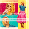
 [01-05]
SPN*, The Americans, BTVS, Captain America: Civil War, The Chronicles of Narnia


 [06-10]
The Emperor's New Groove, HtGAwM, OUAT, OItNB, Pretty Little Liars


 [11-15]
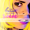
Revolution, Rust and Bone, Sense8, Sleepy Hollow, Stardust


 [16-20]
Teen Wolf, X-Men

 [21-22]
* 6 was inspired by this REALLY COOL song that was playing when I was iconing: The Widow's Bane - Don't Be Afraid, It's Only Death
[01-05]SPN*, The Americans, BTVS, Captain America: Civil War, The Chronicles of Narnia
[06-10]The Emperor's New Groove, HtGAwM, OUAT, OItNB, Pretty Little Liars
[11-15]Revolution, Rust and Bone, Sense8, Sleepy Hollow, Stardust
[16-20]Teen Wolf, X-Men
[21-22]* 6 was inspired by this REALLY COOL song that was playing when I was iconing: The Widow's Bane - Don't Be Afraid, It's Only Death
and the second thing, the results of


- The winner is a bit unexpected but I like it, I had fun making it! it's much more textured than my icons usually are, so maybe this year I'll explore texture use a bit more :)
- 2 is alright, I like the vibrancy but compositionwise it was among the safest from that batch. But on the other hand it was a very good combination of subject + lyrics :D
- 3 was another really safe one, I knew it would place here but I was actually very uninspired during that challenge and just went with something I knew would work cause I wanted to be safe for another round at that lims. Not sure if that quote fits the text arrangement :p
- The rest of these are a bit more experimental which I'm happy about. Lots of text and even some dfifferent compositions. I really like the set that 4 and 7 come from and those two were my own faves from it as well, so I'm happy they placed here!
- 5 took more effort than it looks like so I'm glad it was well received. I like the coloring and the simple text.
- 6 is my personal favorite from last year cause it was really inspired and I love it when something I visioned in my head comes into existence almost the way I imagined it. I spent hours just looking for brushes and textures! I just love it.
- 8 is a happy surprise, it wouldn't be in my top 10 because it's such a weird and messy composition but at the same time I sometimes wish I could go to weird and messy places with my icons more often so I'm glad that those icons have their supporters.
- I really like 9, and 10 has grown on me. I felt like such an idiot for submitting such a ridiculous icon to turbo_rumble, lol. I WAS SO EMBARRASSED that this was my entry for the prompt 'hidden'. But now that I'm not taking it so seriously, I quite like that icon. The image quality is always an issue with gifs tbh but otherwise I like the paintiness and the animation and just the fun aspect of it :)
In general it wasn't the best icon year for me, but then again I say this every year, haha. But really, I had a few high inspiration months and a lot of low inspiration months. I only found like 30 icons that I really liked from last year. I think my problem last year was that most of the time I wasn't into any fandom that would inspire me, and the rest of the time I was into an obscure fandom I knew would not interest anyone (Free!, Dorian Gray, RuPaul's Drag Race, Survivor...) so I didn't see much point in creating icons or putting effort into them. Also, thesis stress was a major factor last year. I think I've laready done much better icons this year than anything I made last year. But, if I have to pick, these are my personal top 10 from 2016:


So, all my winning icons this far:


2012 | 2013 | 2014 | 2015 | 2016
Thanks for people who voted, nominated and otherwise participated! :) Hopefully there'll still be bestoficons this year!
no subject
Love the shapes and composition in 9 and I also quite like the black and white (and the ones with a splash of color) ones!
no subject
Thank you so much :) I love making bw+color icons! I don't usually do full b&w but the oddly challenge challenged me to make some darker icons than I usually would :> idk why I haven't entered before, it's a really fun comm, thanks for running it! ♥
no subject
no subject
no subject
no subject
no subject
no subject
I really like the second DW, very unusual coloring for you, but I love the smoothness and the depth, and the text!
The black oddly icons are all very unusual for you, too. (And I really should have guessed all three of the black ones, but only got one.)
The Americans icon is great! Amazing how you can make her look so severe even with that primary coloring.
Love the composition in the OUAT icon. What a creative idea!
I love the Sense8 icon a lot, even though I keep thinking it's 100% nagini's style. I never would have guessed you. I love the purple coloring in that one so much.
Very interesting points on your bestof icons! Of the highest voted icons, I think #1 deserves the spot at the top. Of the others, I would have voted for 6, it immediately impressed me when I first saw it. I really love 8, too. I like the messiness about it, tbh. And 10 is great. Animation is always hard, and creating an interesting transition effect doubly so.
Of your favorites, #1 is of course already in the other set, so yes, I agree on that. I also really like 3 (the messiness again!), and 6 (I know I already commented on it when you first posted it, and I think I nominated it), and 8 is perfect.
Icon talk is always fun!
Ha, and you did an "all my best icons" summary, I was totally planning on doing that, too. (Not that I have the time to do any of the things I want to do these days...)
no subject
I don't see naginis in 18 at all, it's too matte for that, I think the anon who guessed dixon was a bit closer but I still think that icon is very much in line with what I normally make. But I love Ida and her icons very very much so if it really looks like hers, I'm not complaining, just hoping it's not a constant thing in my icons cause I try to avoid being too referential whenever I can help it!
I wasn't expecting anyone to actually read all those rambles about the bestof winners! :D Super pleased to hear that you liked some of my weirder icons. I hope you were happy about your winning icon too, I think it's gorgeous! I've missed a ton of posts lately but icon talk is always interesting so if you did post a best icons summary, I'd love to take a look.
Not that I have the time to do any of the things I want to do these days...
I hear you... I really shouldn't have rushed to post this icon dump, it was dumb cause now it seems like I don't have anything to post in a while since I'm failing to enter this month's monthlyinspo. Thesis has taken all of my time lately, just now sent a semi-final version to my professor. If there's not a lot to fix in it anymore, I might have a lot of iconing time next month... but that set is still a month away and I really wanted to make a set for this month's theme :/ if the next prompt is technical and not subject-based, I might try to combine the two themes for the April set!
no subject
Aww. It was really an awesome theme, and I had a lot of fun.
There's still theseasonwheel (which for the first time actually inspires me). But I've been ill all of last week and everything I've made for it sucks so badly. I'll have to start over, I think. :/
if you did post a best icons summary, I'd love to take a look.
Sadly, not yet. As I said, ill all week. *sigh* I spent the week watching shows and not interacting much. It's still on my list, so it'll come once I caught up to all the RL stuff that fell to the wayside last week.