
Difficulty: intermediate
Translatable: to programs with gradient maps (&vibrance but it's not necessary)
This was my screencap, originally from homeofthenutty.com:

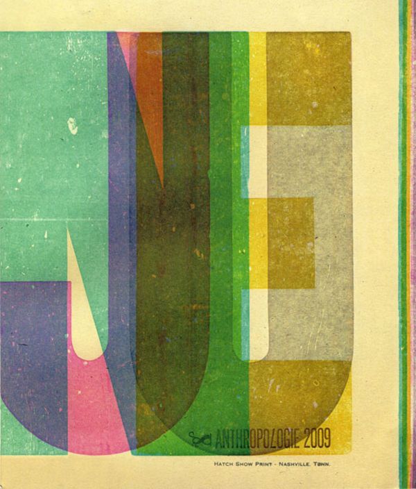
I LOVED the geometric background so I knew I wanted geometry/shapes to be the theme of this icon too.
Step 1: Crop & resize. I went for center crop with negative space cause that's what I do 99% of the time .__.

Step 2: Copper gradient map on Soft light 40% (why yes you will see LOTS of these in my tutorials :p) - this step takes away some of the overpowering shadows and gives the icon a muted, vintage feel.

Step 3: Curves! The base was still very blue, so I used a curves layer to up the green and red channels and also the RGB channel to add a bit of brightness. The points I used (approximately):
RGB: O: 138, I: 128
Red: O: 191, I: 178
Green: O: 159, I: 149

Step 4: It's a bit colorless, so take any color you feel like adding into the cap (I chose light blue #ace3ff), paint over the background walls and set it on Multiply 100%.

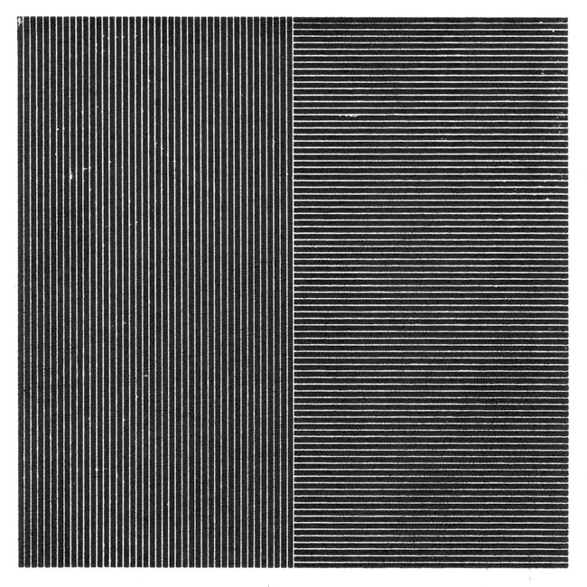
Step 5: Texture time ^^ Take this gorgeous texture, I'm pretty sure it's by slayground:
Resize, rotate and move it around until you find a part of it that works - there are lots of possibilities since there are all those fantastic shapes in the texture! I set it on Screen 50% but as always with textures, play with the opacity to find what works the best :)
This is the crop I used:
 ->
-> 
Step 6: I really like the shapes that the texture brought into it, but the colors don't work at all. So make any gradient map with colors you think could work with the icon, leave it on Normal 100% and clip it with the texture layer so it only changes its colors (you can do this by pressing Alt while clicking the space between the two layers in the layer window).
For whatever reason, I chose a gradient map like this:
 ->
-> 
Looks completely different! (but also very very undercontrasted)
Step 7: Take this texture, also by slayground:
clip it to the previous texture layer and the gradient map, set it on Normal 50% and find a crop for it that works the best. For me it was a crop like this:
 ->
-> 
the purpose of this layer is to make the texture use more subtle, tone down the brightness, and add those borders to the top and bottom :)
Step 8: Let's give him a warmer skin tone! Take a light orange color (I used #ffe8cb) and paint over his face and arms. Set this layer on multiply and find a good opacity (I used 50%).

Step 9: I want more magenta into the shadows, because everything is better with magenta.
Make a curves layer with settings something like
Red: point 1 O: 36, I: 56, Point 2 O: 192, I: 178
Green: Point 1 O: 38, I: 62, Point 2 O: 198, I: 194

Now there's more contrast, but the overall look is a bit too dark for me.
Step 10: Make a Color Balance layer and play with the highlights settings to add some brightness and color into the highlights. I used these:
Red +12, Magenta +10

(I kinda like this version too, I could as well have stopped there. I never know when to stop though so I continued texturing.)
Step 11: This is a really wtf step. Take the texture I used first, invert it (ctrl+I), resize, crop and move it around until you find something you like, try different layer modes and pick something that looks strange but hopefully in a good way. I used a part that looks like this on Multiply 50%:
 ->
-> 
Step 12: Another curves layer to brighten it up. I only used one point in the RGB channel:
O: 163, I: 148

Step 13: Sharpening! I did this in two parts:
- first, a copymerge layer; use Smart sharpen with the settings 100%, 0.2px. I find these settings often work (for my tastes anyway, just play with the settings if you want something sharper or not as sharp :) ). I set this layer on Normal 58%.
- for this icon I still wanted more crispness so I went way back to the base layer, copied it, sharpened it using the regular Sharpen filter, and I set this layer on Normal 40%.

(I know it looks kinda oversharpened but I like it that way I think? Idk why, lately I've been really drawn to sharp things! Most of you will probably want to skip the second part of the step :D)
Step 14: It's clearly not enough of a texture clusterfuck for my liking yet, so I take yet another slayground texture (seriously they're the best if you're looking for shapes and lines and geometry!):
I resize it a lot to make the lines smaller and smoother. There's an interesting part in the texture where the lines change direction; I tried to place this part in the middle.
I set it on Screen, Opacity 94% (??? don't ask), Fill 50%.
The result was too much even for me so I gave the texture a layer mask and masked a the part directly on Dean away.
 ->
->  +
+  ->
-> 
Step 15: This step isn't necessary at all cause I kinda like it with those muted colors, but anyway I made a Vibrance layer with vibrance +98 (what's with the numbers almost 100 but not quite? Like I said, no clue!). Set this layer on Color 50%.

DONE!!!! :)
* * *
So yeah looks like I have a thread at Ask The Maker, so if someone wants to request a tut for another icon, it's open. I save all my psds from ever since I started iconing cause I'm one of those people who never ever throw anything away :p so anything goes!

7 comments | Leave a comment