
Made with Photoshop, not translatable (uses vibrance, selective coloring & gradient maps).
Wow, I sure know how to ramble about the simplest things, but if you're not interested in the theory/thought processes behind this, just read the bolded parts and that should be enough to be able to follow the steps :)
Step 1:
I used this Supernatural screencap:
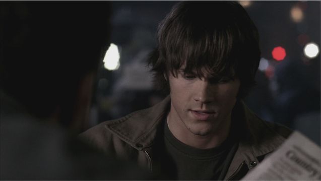
And cropped it on a 200x200px canvas. Normally I use 100x100px right away, but for this one I planned some sort of blocking, and I sometimes start my blocking icons on a larger canvas simply because it's easier to see all the details when the blocks aren't super tiny yet.
I made a pretty standard center crop, just to get as much of him visible as possible, so that I could see which parts look the best when the coloring is done and crop the block according to that. (It might have been an even better idea not to crop it to 200x200px at all but to leave the full cap visible in this size, but I didn't come to think of that at the time.)
Once the cropping is done, use auto contrast (ctrl+shift+alt+L) to add a little contrast cause the blacks are dark grey rather than black and this is the first step to give them some depth.
What we've got this far:

Step 2:
Now, make a Vibrance adjustment layer and turn the 'vibrance' up to a 100. This brings out the little color this cap had in the first place. It looks all muddled and dark and fugly, but it's a start!

Step 3:
My favorite part - gradient maps! Make a gradient map layer using the Copper gradient, which has been used in almost every single one of my tutorials and which is one of my favorite ways to achieve a vintage feel.
Tips re: the copper gradient: use it as it is (= non-reversed) if you want to brighten a really dark image and/or make it 'flatter' and more cartoonish looking and to lessen the contrast. Use it reversed if you want to give more contrast. Or, if you're going for an extra vintagey look, use it on both. Note that copper gradients take away from the lighting and shadows, that's kind of the point, so I wouldn't use them on icons where you're going for a more shiny, lightingy look. With grunge/vintage/matte icons they work great! Also keep in mind that these gradient maps tend to have a negative effect on image quality, they can add really sharp edges etc, so just keep an eye for that and adjust the opacity and use masks and blurring tools when needed.
Here I only used one copper gradient map, I left it non-reversed (cause the cap needed brightening) and put it on Soft Light 100%.

Step 4:
Now it's almost too matte though, with not much drama going on in the shadows or contrast. So next I made a black and white gradient map and set it on Soft Light 100%. Make sure the black parts are placed on the shadows of the image and the white parts on the highlights - if it looks all weird (takes away contrast instead of adding it), you need to reverse it.

Step 5:
It's still very dark and a bit too contrasted but those qualities actually work for the look I'm going for - I knew from the start that this would be a grunge icon, so I knew the base needed to be left a bit dark so that I could put some grungy textures on Screen or Lighten. But, knowing how fugly grunge textures turn when sharpened, I decided to sharpen the icon at this point!
Make a copymerge layer (ctrl+shift+alt+E) and use the Sharpen filter (Filter->Sharpen->Sharpen). Leave it on normal 100%. This (leaving a sharpened layer on 100%) is usually not a good idea because as you can see the result is VERY sharp. However, knowing that the image would be scaled down, it didn't matter that much cause scaling down smooths the sharpness a lot.

Step 6:
TEXTURE TIME \o/
Take this gorgeous grunge texture by jaehos@tumblr:
I didnt resize it at all, I just moved the full sized texture around until I found a nice placement for it. I set it on Screen 50%. I liked the grunginess on the sides.
However, obviously there's a bit too much grunge on his face right now. it looks terrible, so I used a couple of grungy large brushes to give the texture a layer mask. I made the layer mask in multiple steps, blurring it a bit here and there while leaving some edges sharper. You can see the mask I used below.
 +
+  =
= 
We're done with this large cap for now; it's time to start working on the composition of the actual icon!
Step 7:
Make a new 100x100px canvas.
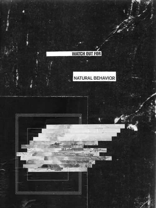
Take this texture (another one by jaehos):
Paste this texture on the 100x100px canvas and resize and crop it so that you see something like this:

It's quite common for me to have a texture as the base, rather than a cap. Usually it means a fake background/negative space style, but sometimes it can also work as a frame of some sort, which is what I was going for here - all the white bars and lines of the texture just inspired the composition freak in me so I wanted to position them so that they'd be around the cap/near its borders.
Step 8:
This is nitpicky and overly perfectionistic, so you can skip this really, but something about the really harsh white grunge in the upper left of the texture bugged me (eye-catching details like that can direct the attention away from the cap so with grunge textures that's something to keep in mind). I used the Patch tool (the what?) to make that area smoother. It only took like two patching steps, this tool is freaking awesome for minor retouching stuff like this - you just select the patch tool, circle the problematic area, and drag the cursor to a reference area, in this case a spot which looks smoother.
 ->
-> 
Step 9:
Now, go back to the large Sammy image, make a copymerge layer, copy it and paste it on the 100x100 texture base. Resize it down to half of its size (doesn't have to be exactly half), then move it around until you like the crop. It's supposed to look like blocking so it's ok if the Sam cap doesn't fill the whole canvas - we want some of that lovely grunge background texture to show!
I ended up with this:

Step 10:
I noticed that next to those white bars, his skin looked too dark and maybe a bit too red. So make a Selective coloring layer with these settings:
Neutrals: Magenta -5, Black -10
and that's the only channel I touched, there wouldn't be much point using the other channels since there really aren't that many different colors in this particular image :p
Anyway, look much better to me now!

Step 11:
More texturing. The biggest problem with the composition right now is that the Sam block awkwardly fills the areas where the white bars were supposed to be. That's easy enough to fix - just go and copy the background texture (with the bars, the retouched version), drag it on top and set it on Lighten, 100%. This brings back the white bars, yay!
But wait, there's a huge white thingy over his eyes. Yes, I did position it like that on purpose, just to see if it would work - bars over eyes can look pretty cool when done right - but in this case it didn't work for me, sometimes you have to kill your darlings if the result isn't as cool as the concept you had in mind. I think the reason here is that I liked his full expression, the way his eyes are almost shut makes it look like he's lost in thought and maybe a bit sad/disappointed, but obscure his eyes and what you have is a slightly silly-looking mouth curve and not much else :p
So, just give the texture a layer mask and mask away the distracting part.
 +
+  =
= 
Step 12:
The only thing missing now from the overall look is text! With a totally lopsided composition like this, there were only two choices really:
a) actual blocking where I'd look for another cap to use on the left; or b) text that could take some space on the left. a) was my initial idea, but for some reason I ended up going for b), I honestly don't remember why, I think either of these ideas could have worked.
Start just by writing some text on it. I had written down a few quotes from the show; it's a good idea to keep a 'text collection' in some file, you know, quotes, lyrics or random pieces of text that would fit each of your favorite fandoms. My SPN text file contains only quotes this far, and the majority of them are funny which clearly wouldn't work with a serious, sad-looking cap/color scheme like this, so in the end I only had a few choices and for whatever reason the only one of them that would work here was this extra emo quote: 'No matter what I did, it was never good enough'. (about their father)
I tried a bunch of different text arrangements and fonts. In the end I chose Vinyl Stickons for the font, cause it's a slightly retro font that's really long vertically yet compact horizontally so I could fit in a long quote like this and still keep the size rather large and readable.
For the text I had to do a lot of settings manipulation to make it look decent, just go wild with the Character panel (Window->Character). This is a summary of the tricks I used:
- 'no matter what I did, it was never' is in 9pt size and uses the color #bababa, while 'good enough' is 12pt and in color #e4e4e4 (probably picked from the white bars, so that it would fit them, the other grey is from some other part of the image, this is my usual method of picking font colors)
- I didn't want the letters to be quite that squeezed together, so I increased the tracking up to 40
- I used 'Crisp' for the antialias setting, because it made the characters the clearest
- I wanted 'what I did' to align nicely with 'no matter'; my first instinct was to increase the tracking in 'what I did', but that made the characters blurry (some tracking values obviously fit some sizes and fonts better than others), so when that didn't work, I placed the cursor in the space between 'what' and 'I' and increased the kerning up to 90, this adds space between those words while keeping the other kerning values intact. Note: there are probably easier ways to achieve the same in Photoshop, I just can never make some of the text tools work so I go with what I know. (seriously someone explain that damn 'full justify' feature?? It never looks right?)
So, clearly things like these are why it takes me forever to make a text icon. The end results without and with text trickery:
 ->
-> 
Then I copied the text layer and put it on Normal 20% just to make the text a bit stronger but the effect is barely visible so I'll skip the demonstrative image.
Step 13:
Now comes a weird extra step.
Usually I'd rasterize the text layers and blur them with Gaussian blur 0.2 or something like that. In this case that didn't work cause the icon was supposed to be a bit sharp and grungy so in order to stand out from the grungy background the text had to be crisp rather than blurred. In fact, in this very rare case I even had to sharpen the text a little, and that should never be done tbh. But just look at the 'never', especially the E and R - they look really unclear and blurry and foggy.
So I made a copymerge layer, circled the blurry-looking letters with the free selection tool, used the Sharpen filter again and lowered the opacity to something like 20-30% (I don't have the exact numbers cause this was a last-minute add step that I did directly on the already merged down icon).
RESULT:

aaaannd we're done. Layers (left panel is for the large image, right for the icon-sized):


Hope this was any helpful!! Please ask if this leaves any questions :)
Current Mood:  accomplished
10 comments | Leave a comment