Icon progression post, part 2

I know, I know, everyone else has already moved on to 2013, but I'm still making progression posts :p Anyway, this is the second part to my progression post (the first part here), and this part is all about 2012. This one isn't quite as lulzy when it comes to bad icons (I would hope so at least!), but hopefully this is more interesting from a progress point of view? Idk.
Warning: image heavy and rambly. This might get weirdly scrambled if you click the cut, so I'd advice to click the title!
Again, all the icons link to the post containing them, and I'm using the making month instead of posting month if they're different.
January 2012 aka The Glowy, Saturated Month


I started the month with some over the top lightblobby stuff for
A PLOT TWIST and a really really big step for me - I participated in
Next was another farscape_20in20 set - again super colorful, but I dumped the glow for a slightly grungier style. I like the general look/idea of this set a lot, but there's a technical flaw or two in each of the icons and I find the texture use and lighting especially lacking.
I was really competitive and ambitious (even more than usual) during the whole month, and had more stress than fun :/ This was obviously doing it wrong.
Favorite set: The last one (farscape_20in20) | Least favorite set: inspired20in20
Favorite icon: 8 (I somewhat like the blend) | Least favorite icon: ugliest experiment ever tbh
Icons made: ~90
February 2012 aka The Oversharpening Month


The HP set for
Then I made a big post with stuff from a
Favorite set: inspired20in20 | Least favorite set: farscape_land battle
Favorite icon: 2 (the earliest case of me using that particular favorite texture - also the first icon by me that ever made it into a praise post! Aw.) | Least favorite icon: WHY the blue panel why, also really blurry and LQ looking with bright pink shadows.
Icons made: ~82
March 2012 aka 'To Hell With Quality, Let's Experiment Even More' Month


Ok, the icons I chose to show here are ok, but seriously this month had a lot of wtf and just plain ugly stuff.
First I made icons for
These only paved way for a freaking HORRENDOUS set of farscape_20in20 and I Am Number Four icons; I have no idea about these really, it was all experimenting but idk calling it that kinda gives a bad name to experimenting cause I've experimented better, right? ._. I like 6, but the set also contained this, this, this, this and this, so... yeah. My worst 2012 batch probably.
This month I started seriously planning an icon journal, but didn't want to do it alone, so I teamed up with the awesome
Oh and a major step for me: I applied to
Favorite set: TBBT for inspired20in20 | Least favorite set: those random I Am Number Four icons
Favorite icon: 4th example | Least favorite icon: This is nausea in icon form
Icons made: ~92
April 2012 aka Playing It Safe Month


First I made some Hermione icons for
Then was my GoT set for
Next up was a really quite boring and lame and weak farscape set (my quickest fs20in20 set to date). I tried to practise lighting, but I'm not sure how well I got that down. These aren't atrocious like the previous set for the comm, but it all looks just meh and blah to me.
I was randomly invited to
Favorite set: GoT for inspired20in20 | Least favorite set: farscape_20in20
Favorite icon: None quite work for me, but I suppose 3 | Least favorite icon: KILL IT WITH FIRE. Oh except it looks like someone already has.
Icons made: >94
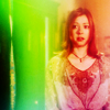
May 2012 aka 'What the Actual Fuck Is This???' Month


Omg, so many sets this month. First I made some experimental John/Scorpius that no-one liked for farscape_land, kinda wtf but I have no regrets. Then was the BSG set for big20in20, the theme (geometry) inspired me a lot, though many of the results were a bit random (I used math stuff as textures ok). Still, 2 is in my top 5 of the year, I'm super proud of it!
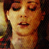
Then were the two of the sloppiest sets ever: Willow for character20n20 and Picturesque round of inspired20in20. I made all of the 40 icons in two days o_O it shows. I went for a vibrant, glowy and horribly blurry style, lots of bad coloring and some real wtf.
I reapplied to 20inspirations (cause they were closing application soon) and undeservedly got in. The round was almost over when I did, so I made another really quick and crappy set, most of the icons are overtextured even to my liking(!!). I quite love the Vulcan pride one, and 9 and 10 are nice, but there's some truly hideous stuff in the set too and I'd rather just forget that this was my first set there :p
As if all this wasn't enough, I participated in ![]() turbo_rumble for the first time. I was stupid and literal and thought the icons had to actually look like they're from 2009 or something, and mine sure did. These two embarrass me the most. I really love 11, but the rest was varying amounts of crap.
turbo_rumble for the first time. I was stupid and literal and thought the icons had to actually look like they're from 2009 or something, and mine sure did. These two embarrass me the most. I really love 11, but the rest was varying amounts of crap.
This month could have been pretty damn awesome if I hadn't tried to to EVERYTHING. Cause the hits here are really good imo, but I was so busy (I even had an exam week this month! o_O) that most of my icons were not quite there.
Favorite set: uggh big20in20 if I have to choose | Least favorite set: it's a toss between turbo_rumble and Willow
Favorite icon: 2, love the composition and coloring | Least favorite icon: The quality astounds me + freaky eyes
Icons made: >124 o____O ok then.
June 2012 aka 'Everything but the Kitchen Sink' Month


Another month with a ton of challenges. First was a Chiana/Sikozu for farscape_20in20, gave me a chance to work on my blocking and blending. This set bores me a bit, but is of better overall quality than any from the previous month.
![]() big20in20 actually used a theme I had come up with :) I still quite like the multifandom batch I made, it has some nice coloring and texture use, but none of the icons are really showstopper material.
big20in20 actually used a theme I had come up with :) I still quite like the multifandom batch I made, it has some nice coloring and texture use, but none of the icons are really showstopper material.
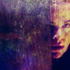
THEN, a fugly BSG set for ![]() character20n20, these are really sloppy and blurry with bad texture use. I tried a darker, grungier style. Some worked slightly better (and even they are forgettable), some not so well, and this gem even makes it in my top 5 ugliest icons of the year.
character20n20, these are really sloppy and blurry with bad texture use. I tried a darker, grungier style. Some worked slightly better (and even they are forgettable), some not so well, and this gem even makes it in my top 5 ugliest icons of the year.
I participated in ![]() 21tvthrowdown and did quite well with my Faith set, even though most of them were pretty sloppy (again, sigh). The most important set this month however was my 'About Me' set for
21tvthrowdown and did quite well with my Faith set, even though most of them were pretty sloppy (again, sigh). The most important set this month however was my 'About Me' set for ![]() 20inspirations. This is my favorite challenge ever, cause I like to ramble about myself and pretend it's interesting. I went for complex icons and loved coming up with creative ways of translating parts of me into icons. That's why this set means a lot to me and while I can see that many of them are lacking in execution, I really love the ideas behind them all, and think that with minor tweaks they could be awesome.
20inspirations. This is my favorite challenge ever, cause I like to ramble about myself and pretend it's interesting. I went for complex icons and loved coming up with creative ways of translating parts of me into icons. That's why this set means a lot to me and while I can see that many of them are lacking in execution, I really love the ideas behind them all, and think that with minor tweaks they could be awesome.
I also took part in the first icon battle at ![]() icon_talk with dull results, and somehow got nominated for Best Scifi at
icon_talk with dull results, and somehow got nominated for Best Scifi at ![]() magicawards, which I really didn't expect but it and all the +1s and votes warmed my heart a lot and made me believe I wasn't far from being good enough, whatever that means.
magicawards, which I really didn't expect but it and all the +1s and votes warmed my heart a lot and made me believe I wasn't far from being good enough, whatever that means.
I also finally created this comm that our little group had been planning for months, lol.
Favorite set: About Me | Least favorite set: Adama for character20n20
Favorite icon: 9, it has the most meaning for me | Least favorite icon: I already mentioned my great love for this -.-
Icons made: ~103
July 2012 aka 'Quality over Quantity, Fucking Finally' Month


This was my least iconful month, which might be why I like most of the icons I made. First was a mini set for
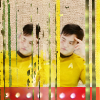
Then was what is probably the best set I've made for farscape_20in20! A lot of effort went into those icons and I pretty much love them all :) Lots of bright candy colors (can you tell that they're my favorites?), some nice texturing and lighting and composition, text that doesn't completely suck, I just love this batch ok! The worst one is probably this, but even that isn't that horrible, just a bit wtf.
I placed third in
Another icon battle at
It's difficult to estimate how many icons I made cause there were a few for flash comms and other random stuff.
Other highlights:
Favorite set: farscape_20in20 | Least favorite set: 21tvthrowdown
Favorite icon: 2 | Least favorite icon: Why didn't this yellow-faced mess get me eliminated from the LIMS?
Icons made: ~67?
August 2012 aka The Relatively Simple Icon Month


This month I challenged myself at
I participated in
I also started making icons for
Favorite 'set': the icons made for theiconquest | Least favorite set: turbo_rumble
Favorite icon: 6 | Least favorite icon: why would I ruin a perfectly cute Master cap like this ;_;
Icons made: ~72
September 2012 aka Practising Every Possible Skill Month


Next up was a mediocre and pretty safe Chiana set for farscape_20in20. There are lots of fillers in it, but no real fuglies. The ac set with the random lyrics was a bit weak maybe, but I liked some of my theme icons, esp 6 and 7 here.
I then made the rest of the ginormous theiconquest post where I used all my five attempts at once which was against the rules so oops :/ But hey, I loved the set!! I mean that many icons are bound to contain some fillers and I'd like to sharpen a lot of these, but the majority of those icons I'm happy with. My focus was texture use and lighting, and making those DW icons started my short-lived but nice-to-have-had obsession with mutedness and simplicity. ALSO, I think I did fantastic with the Survivor set - you have no idea how LQ my material was. I'm talking images of this quality!
Favorite set: scifi20in20 | Least favorite set: farscape_20in20
Favorite icon: 2 | Least favorite icon: I swear this looked good when i made it D:
Icons made: ~150 o__O
October 2012 aka 'Lighting All the Way' Month


The month started with the Master, which is the best way to start anything tbh. The 'muted' category theme at
I applied to
I wanted to try another text set to get better at it so I had my own little challenge with
Also lots of icontest participating (
Favorite set: character20n20 | Least favorite set: theiconquest
Favorite icon: 1 | Least favorite icon: Flattest monochrome ever :/
Icons made: ~86
November 2012 aka The Mostly Muted Month


Basically I like most of the icons I made this month, and some of them I really love.
I had an awesome Master icon battle with
Then I made some icons for the
Next was a muted DW set for
The pale round of rainbow_elite inspired some simpler icons and close crops, not as good as my vibrant set but I like some a lot.
Favorite set: Vibrant rainbow_elite set | Least favorite set: Wizard icons for theiconquest
Favorite icon: 8 | Least favorite icon: I don't really hate it, but this one is unoriginal, blurry and LQ-looking
Icons made: >110
December 2012 aka The Colorful Grunge Month


The most important set of the month for me was the first one - DW icons for
My next set was a Christmas present for
Then there was the farscape_20in20 set where I tried to continue in the vein of that inspired set, and some results I looove for the texturizing and candy coloring, while some were made in toothachy hell which shows.
Other icons made in December include a
The highlight of the month would be a toss between what happened with the insp20in20 set and being invited to
Favorite set: inspired20in20 | Least favorite set: first the7days entry
Favorite icon: 3rd example | Least favorite icon: I just wanted to see if I could do the whole painty style, the answer is obviously NO.
Icons made: ~114
Icons made during the year: ~1200 WHAT I HAD NO IDEA THERE WOULD BE SO MANY omg I have no life.
Icon posts: 33
So this was my 2012, hope you agree that it was an improvement from the previous year :) Nobody will actually read these rambles, but I really loved writing this if only for the opportunity to scrutinize all my sets. My progress hasn't been very linear cause my style jumps all over the place, but I suppose the slope of the quality curve has been positive for the most part, and I hope I can keep that up! Also making this post really showed me how freaking many icons I've made, which is why one of my icon resolutions was basically to make a bit fewer of them this year in an attempt to focus on quality over quantity.
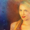
And now I'm finally ready to move on to 2013, expect my next post (character20n20 + Rose Tyler) in a couple of days :)
no subject
You clearly rock 'grunge' all over the place though - but I love how you can switch between dark, muted and vibrant so effortlessly. I think it boils down to the way you can use textures to compliment your colouring so beautifully. I am incredibly impressed that you did an entire 20in20 set WITHOUT textures though (I had to make one icon and pretty much cried myself into a ball of fear before going there) annnnnd a set that had text as a claim. That is impressive indeed.
I appreciate your icon resolutions as well, and can't wait to see where the 'experiment' portion takes you, mainly because the icons you picked from November slay me with their amazing crops, so if that's any indication of where you will go I am VERY excited. I'm also here to say that no matter the length of the comment from you (one sentence or longer) it will always be appreciated. I think sometimes people get too invested in length of comments etc, and forget that in the end the person took time to make the comment and that's what counts to most. You are beyond generous enough with your comments as is!
In any case, THIS POST IS FULL OF MAGIC. And reminds me of how much I have truly enjoyed watching your style grow & change throughout the year ♥
no subject
Another thing I'm just SO glad of is that you seem to approve of my texture addiction and even call it a strength! I always worry about if and when it's too much, so this really made my day. And yeah, both the textureless and the text sets happened just because it just bugs me if I know I'm bad at something, so I do this counterintuitive thing where I focus on improving my weaknesses rather than highlighting my strengths and taking them further. It might be a bit stupid cause it leads to sets that aren't as good quality as they could have been, had I taken the other option, but then again I always love challenging myself so I don't know if this strategy will continue this year or not, we'll see!
Glad you like the resolutions! I'll just have to keep them clearly in mind, cause the center crop + negative space happens so freaking automatically when I'm not thinking. Oh and major thanks for the commenting encouragement too, I know people should - logically thinking - appreciate a short comment better than no comment at all. But then I start worrying that if I leave just one sentence, they'll think 'what, doesn't this john_scorpy person usually leave much more in-depth comments, guess he didn't like my set much then' and in the end the comment will be more of a disappointment than not getting one at all would have been. But then again I may be thinking too much again, and people might actually have better things to obsess over than the length of some random person's comments. Also it's really good to hear that you at least don't see it like that (still, comments to you are far from the first thing I'd cut content from - I'm mostly thinking of entries I 'have to' comment on, in 20in20s and such, and also really big posts like battles where I usually don't even know where to begin).
Thanks again for taking the time to take a look at a post like this, it's really appreciated and an unexpected treat considering the size of this thing!
no subject
I've stalked/watched/lurked around your comm. for so long that I can't even remember when it started and your style got so better that I's like wooot!!! how did she come up with this and ::ughhh:: why is she making so many doctor who icons when I don't watch it ::pout:: the universe does revolves around me you know. ;-P But after seeing this post I really couldn't avoid taking one ::sigh:: I'm resisting on taking anymore, for now at least ;D But I know it won't be for long because I love when you abuse as you said (I so don't agree with that) textures, oh God! the colors you come up with are so fucking amazing! And the grunge, shit, your grunge is a dream come true but please, damn it, please don't get me started on your muted colors because I really don't know how to describe their awesomness!
with that said I've to summarise all of this with three simple words - You Are Awesome!
no subject
I love that you appreciate the texture
abuse and the grunge and everything, well except the Doctor Who, haha - I now feel guilty cause I'll be posting yet another DW batch tonight :p but also really freaking flattered that you chose to took one DW anyway! I know I icon it sooooo much that I should probably try something else again. I have plans to make some HP icons at some point, maybe next, and hey you like Buffy right? (I'm pretty sure I remember you from whedon_elite) and I haven't made a full BTVS batch in a while, so maybe I'll make some icons for it too at some point :> but if you have some other shows you'd like to see me icon then I'd love to hear it! :D Oooh and you're the person who made that fantastic yellow/magenta John crichton icon at scificontest right?? Does that mean you're a scaper too? Cause that's definitely another show I'll probably keep iconing no matter what.I didn't even know I was any good at mutedness though! :O I love to vary it up between muted and vibrant so while my next batch is kind of a color explosion, I already feel like I'd like to mix it with some muted ones again for whatever I'll do after that!
THANK YOU SO MUCH AGAIN FOR THIS FANTASTIC FEEDBACK. It really made my day!
(oh and I'm not a 'she' btw :D)
no subject
And no, don't feel even kind of guilty because well that's the show you like and one should icon what he likes! I'll just patiently wait for a request post ;-P or a few more D'argo icons because he's my man!::sigh:: I think that I've had a crush on him back in the days (: I assume that and the countless evenings me and my sister waited patiently for Frarscape to start (including a few reruns ;D ) do make me a scarper. :D And yes I'm at whedon elite because damn but this guy knew how to make shows! And vampires do not sparkle damn it nor are all humans in general and human girls in particular are not so stupid but anyway I got a bit sidetracked...
yes, I'm that person ;) that girl [or a woman really ;D that's what I've been hearing lately ::brrr:: ] ;P that made the yellow/magenta icon :) your posts reminded me why I liked it so much ::sigh:: so I couldn't resist ;D and that's also why I gave you a farscape icon in the remake acc.
just so you know ... I'll continue to lurk even ;P if your main focus is dr. Who ;) Rose and Amy are so pretty ...
bye ;)