


Oh wow, where do I start?? Everything is so pretty. LOVELOVELOVE the composition and texture work in the Sherlock icon, and I'm suuuper happy it's also a subject I like particularly much, cause I'll definitely snag it :) The John one is really cool and creative, very interesting composition and texture work, I keep wanting to stare at it cause there are so many wonderful details to see! The Cosima icon is just WOW, super eye-catching vibrant candy colors (HOW do you color??! *__*), and ofc the composition is great too. The intense close crop on Kala looks fantastic with the gritty texture use and the sharpness is spot on!


All your close crops are always amazing and I particularly adore the Sherlock one, when I first saw it I was like WOW WHAT IS THIS :O It's so flawlessly crisp & hq-looking with perfect cropping, coloring and lighting, really stunning work! The same can be said about the Cosima icon, and I'll add that I really love the bold bottom corner cropping. I looove the minimal look on John, the muted coloring look gorgeous and I love the subtle text work plus there's something really amusing about the fact that it's such a clean and elegant icon yet the quote is so funny and weird. Great icon :D I also love the coloring on Peter and it's impressive how you managed to make it that bright, I know those Peter caps were hard to work with but you got a really fantastic result!


The John icon is STUNNING! it is by far my favorite in this set, the texture work and composition are fantastic and the b&w is perfectly contrasted. The coloring on the Kala icon is extra pretty, I love how bright and vibrant it is, the flowery background feels fitting for the character/couple and there's lovely symmetry in the composition. The blending on Peter is really well done and I love the texture use - the flames not only look great but also are thematically fitting for the character. Ravi's is really fun and whimsical, love the vibrant colors and the crazy texture work!

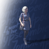
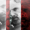
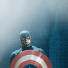
Oh wow, the Kala icon is super beautiful. Love the bright pastelly coloring and the lighting is so wonderfully glowy and the borders frame it really nicely! Liv's is really atmospheric, again the lighting is gorgeous, and I love the monochrome look and the background text so basically everything about this icon just works perfectly. Love the composition on Rick, the bw+red color scheme always works for me and vertical blocking is super difficult to do cause how do you fit anything into a vertical block wtf, but this looks great! I also love the pale cool coloring and extra shiny lighting on Steve.
Gorgeous work everyone, thanks again for participating and hope you had fun :)