The "time management" icon is brilliant.
The random praise is hard to figure out O_O, I love what you did with it! The text certainly looks 3D to me. (Funnily, I got this comment last week: "I love the whole almost 3D effect you've got going on in #1" for this icon:
- now this does *not* clear up what people mean when they say 3D, does it? :D )
hey David Genat looks great with flowers :3
:D He sure does. I love how he's so small and the amount of blocky color around him makes him look like a bit of a wallflower. Perfect composition! <3
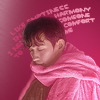
THE QUOTE IS WRONG ON PURPOSE
But but but... triple boob! :DDDD
Love Rygel and his candy collection! The icon remake came out beautiful, and the coloring and hairpainting in 14 is perfect. I love the text placement in 15 (and it still looks very much like one of your icons, even if the palette itself is not your go-to combo).
That artwork is really tough as inspiration! Love the result! It still looks church-y. :D
Love the hair in 17. 18 is AMAZING. That's some really great result from that inspiration. I had so much fun with the poster and book cover and album cover inspos, I can't even tell you. That was such a great idea!
In short: awesome set! Thank you so much for the idea with the randomizing! <3